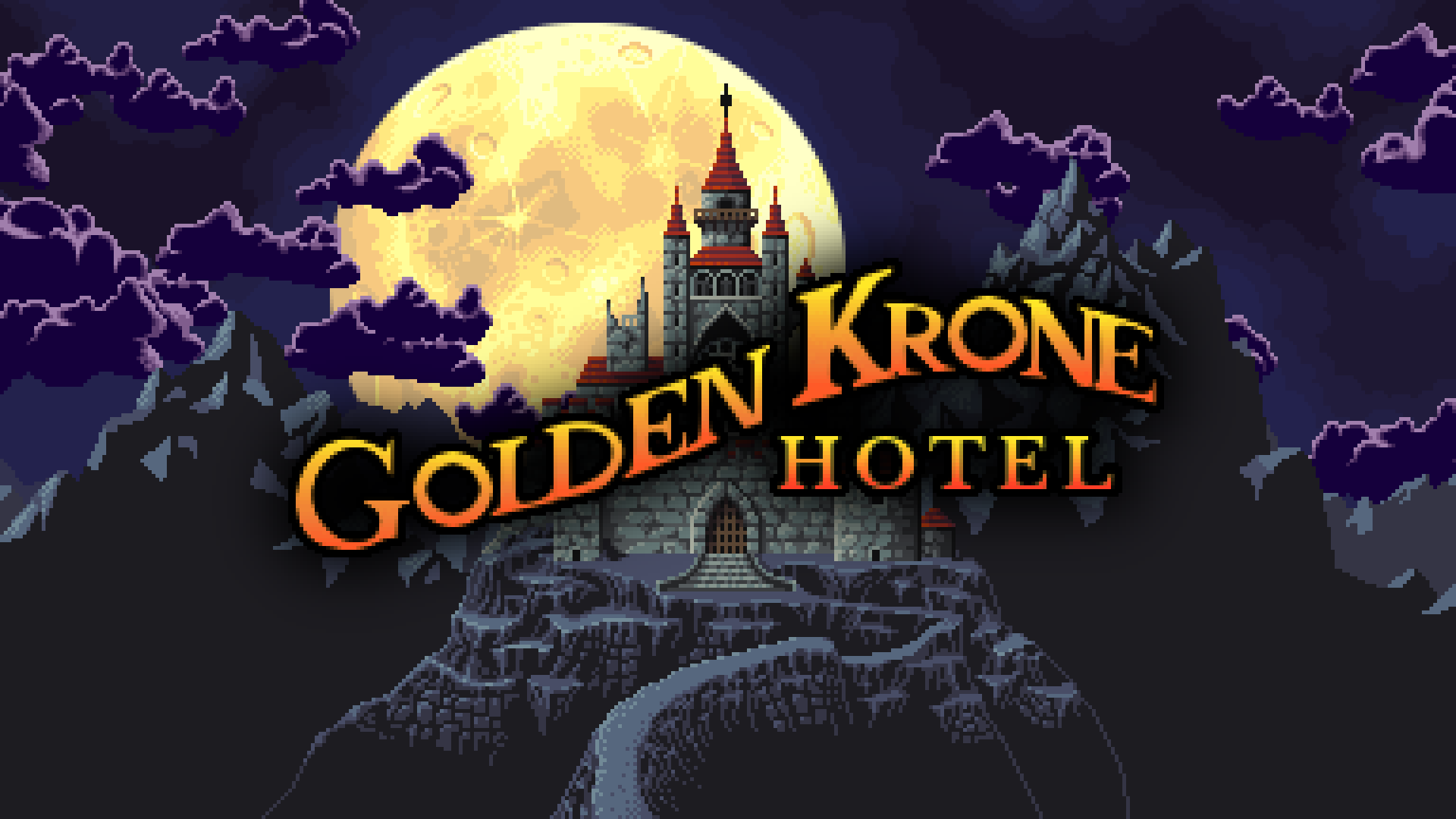
Golden Krone Hotel is nearing release on Early Access and it’s gonna need an honest-to-goodness title screen. I think I’ve come up with something pretty cool, so here’s a post showing how it was done.
click to embiggen
I’m often overwhelmed when I see big pixel art pieces. I hope breaking it down step by step makes it seem a little less intimidating. The thing about pixel art is it’s very procedural. Much of the work behind making pixel art is just following a series of simple procedures (proper outlining, anti-aliasing, shading, etc.) I don’t consider myself an artist in the slightest, but I’m usually able to get some OK results by just following the right steps and having some patience.
A little context
During game jams, I typically just slap some stylized text on a plain background. Here’s Golden Krone Hotel’s old title screen:
I’m happy with the creepiness factor (all accomplished with a little CSS magic), but it’s otherwise pretty boring. I needed something that establishes the setting, theme, and style of the game all at once. Dumping text on the screen doesn’t do that.
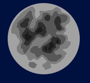
I got slightly more elaborate during the Greenlight campaign:
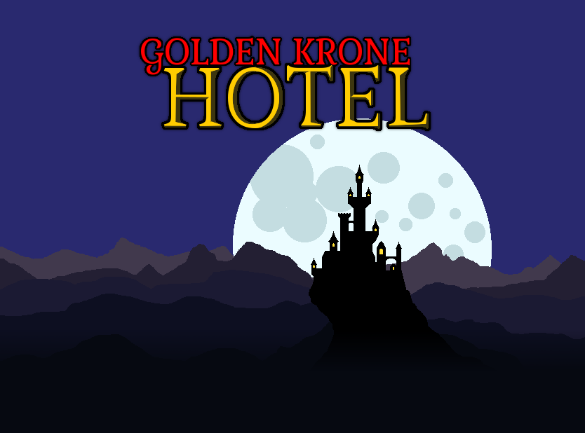
Obviously, I made that rather quickly. It is closer to the end goal. Let’s be honest, I’m basically trying to evoke thoughts of “Dracula’s castle.” This image establishes the theme and setting (a creepy tower), but it doesn’t look very professional.
I decided to follow the same idea going forward but with the the whole thing completed fleshed out. No silhouettes. No MS Paint moon. I wanted to leave room for animating it all, so I knew the following layers were needed:
- Background
- Clouds
- Moon
- Mountains (multiple layers)
- Cliffs and path
- Castle
- Logo
A lot of work, but I slowly chipped away at it over several weeks.
Putting in constraints
First things first. At the beginning, it’s a good idea to decide on the resolution of the final piece. I looked up the display resolution of SNES and arrived at 256×224 (which I later expanded to 400×224 to match wide screens). It’s not that I consider my game to be “retro”, but people will often label any 2D pixel art game retro anyway. Why fight it? Besides, constraints are super helpful. That’s already about 90,000 pixels, each of which I have to make a conscious decision about. If I tried to draw a piece at the resolution of my monitor, 1920×1080, now we’re talking 2,000,000 pixels.
Also a note on colors. I’ve been using two techniques recently for picking colors and I’m loving the output.
The first is blending between two colors.
The second is manually shifting the hue (towards either yellow or purple) and saturation as you change the lightness of your color scale.
Humble beginnings
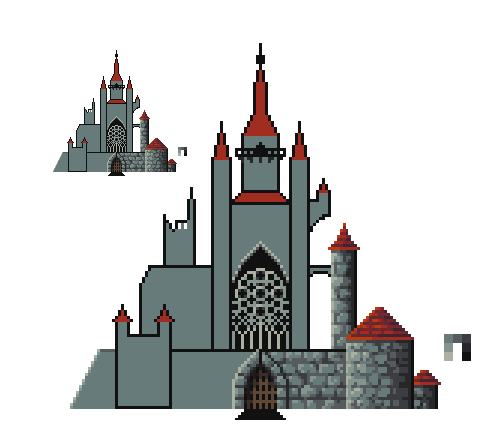
Besides a few scribbles of the basic shapes (mostly fitting into a big ass triangle), here’s the first thing I drew:
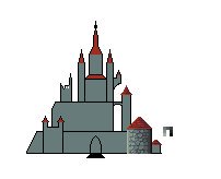
I outlined the major shapes of the hotel, which has also functioned as a cathedral and a castle in the game’s backstory. My goal was to demonstrate the height of the hotel and to simultaneously make it feel sprawling (so there is plenty of room for many floors and branches). There’s a bit of symmetry but I also wanted to break that up.
The sketch didn’t look amazing, but at least I had a nice method for coloring the stones of the castle: creating a bunch of 4px tall stones, trying to avoid them looking too perfectly rectangular, and adding a tiny bit of highlight here and there. Adding some occasional darker shadows in the cracks between stones gave it some more depth.
Here’s the castle after continuing the stones and adding an elaborate stained glass facade:
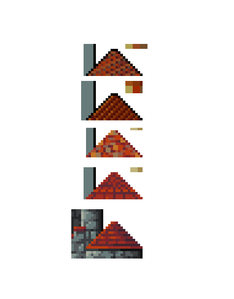
One of the hardest parts was settling on a method for detailing the roofs. Sometimes pixel art is just trial and error until something looks right. I tried all sorts of diagonal roof tiling, but it kept looking awful. I settled on a simple horizontal tiling with alternating dark/light lines.
And here’s the final version. I added a few details such as a sloped wall, a portcullis, statues, and stairs. I also added a second background tower on the right to give the whole place more depth and really tiny doorways to try to establish the scale. Otherwise, it was just a tedious process of filling in the remaining stones and roofs using the same procedure I had already figured out.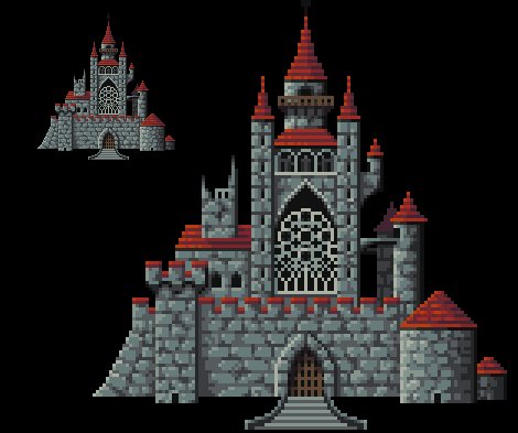
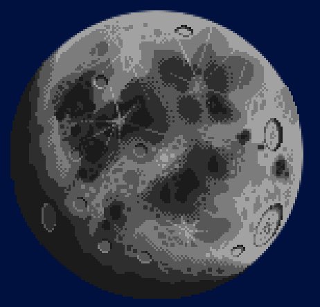
At this point, I decided to sketch out the rest of the piece. I wanted a giant, clearly unrealistic moon.
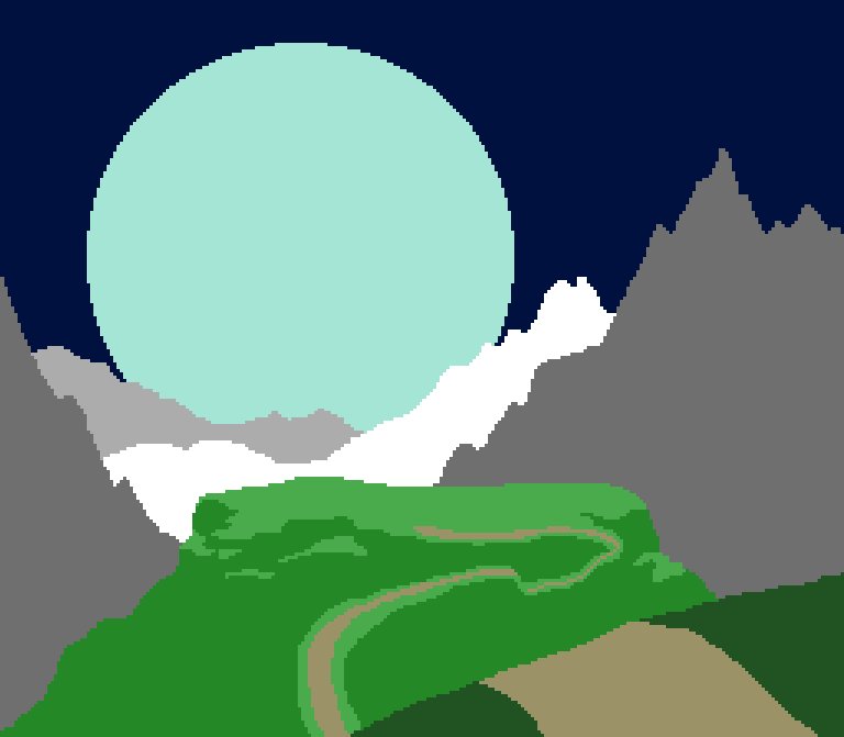
Then it was onto finishing the mountains. The back 2 layers aren’t that complicated. The farthest has a single color and the middle one only has two. The foreground mountains are a little more detailed.
The home stretch
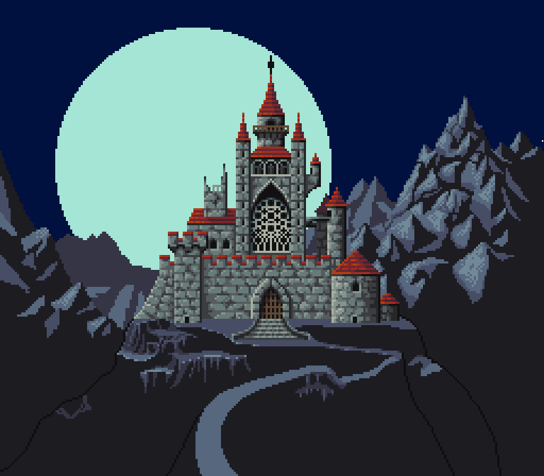
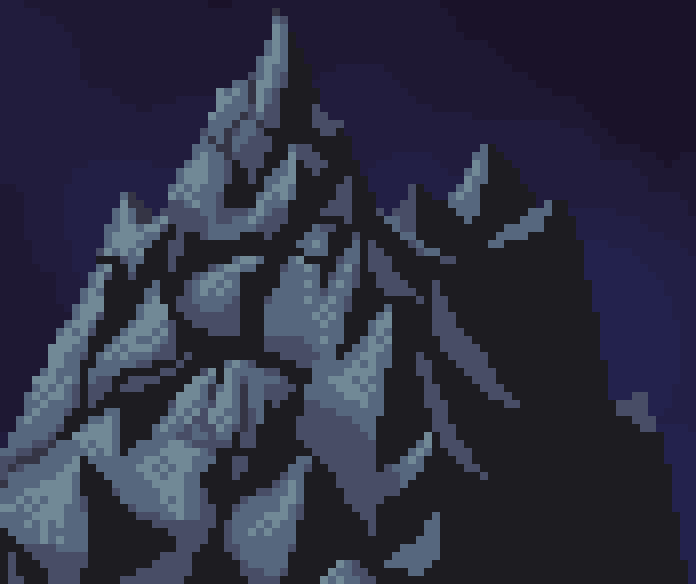
I’ve never been really great at mountains. I found this image really helpful to use as a reference though. I chose the light source to come from the left (which maybe sort of makes sense with the off center moon?). Basically, that means a bunch of little pyramid shapes that are mostly lit only on their left sides. The shapes obscure each other and have their own little cracks and details. The right side of each peak is mostly left with the darkest color and almost no detail. That was a little hard to live with at first, but those big open areas of solid color work really well.
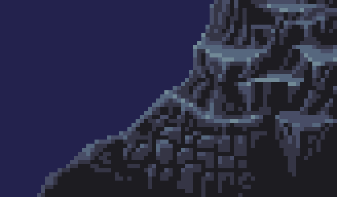
These cliffs were really challenging! The process boils down to drawing little vertical protrusions/ridges that stick out from the bottom of each cliff. As I finished off the cliffs (and started looking at reference photos), I also tried jamming a bunch of almost-square rocks together and that worked great. As you look further down the cliffs, they start to lose the highlights and the shadows dominate until it’s a solid color just like the mountains.
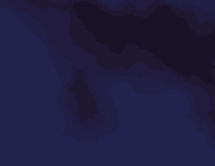
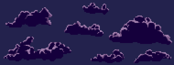
Even with clouds, the sky was going to need a bit of detail. A few years ago I would have tried a big gradient but that that can look really bad. I looked at a few pixel art works that depicted night skies and noticed a recurring pattern: layered, bubbly clouds with very low contrast between each layer. If you’re not looking for it, it’s difficult to see these details in the final piece. Yet they’re truly necessary.
Moon time. It was obviously helpful to look at photographs of the moon. I noticed a few details:
- Huge dark splotches
- Lots of craters big and small
- Lighter starburst patterns
Humans are pretty bad at generating random patterns. I didn’t think I could do those dark splotches justice. Thus, I turned to a nifty feature found in most graphic programs: difference clouds.
Besides the features described earlier, I also shaded the moon and added dithering between some colors. Gray was only a starting point by the way. Colorizing an image in tools like GIMP is really easy. I tried out blue, purple, silver, and even blood red. A bright yellow, almost washed out, ended up looking the best.
I was not looking forward to drawing clouds at all. Clouds are weird.
I had to study a lot of reference images to figure out what was going on. And it’s surprisingly hard to find good photos of clouds at night. Finally, I realized something important about shading clouds. When the sun/moon is directly behind the clouds, they don’t have highlights around the edges because that’s the direction of the light source. They look brightest there because the clouds are thinnest there. So that’s logic I tried to use. I initially had highlights on the bottom of each cloud too, but I removed them so that overlapping clouds would blend together better.
Final touches
I certainly needed to come up with a cool logo. Since Dracula is set in the late 19th century, I googled for “19th century signs” (I have absolutely no idea if any of these are actually signs made in the 19th century):
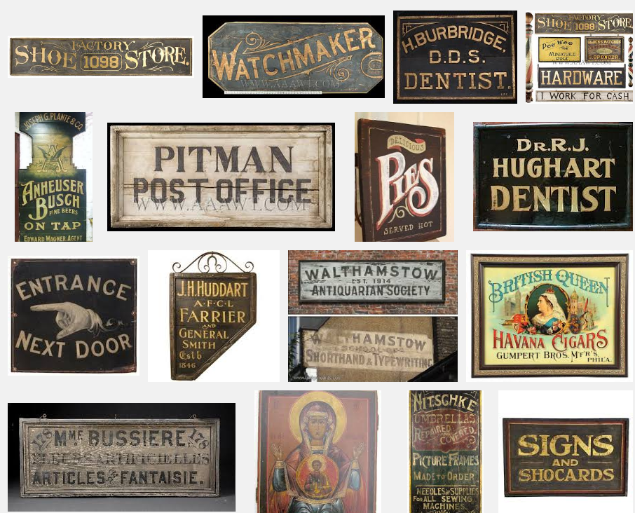
Anyway, one thing most of these signs have in common is curved text. I drew curved guides and lined up the text to fit them. Then, the “Hotel” fit nicely in the pocket below the rest of the text. There was still the work of manually adjusting the features of each letter to line up flush with the guides, but I was able to do that with the pen tool.
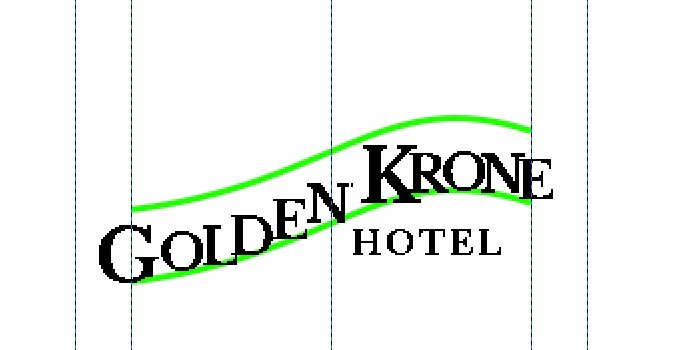
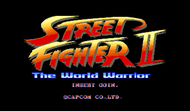
I thought about making detailed gold lettering (like the Shovel Knight title screen), but fuck it. I was getting a bit lazy at this point and, anyway, doesn’t the Street Fighter II logo look awesome? So I put a orange-yellow gradient on it, a black outline, and a prominent shadow for readability. Done.
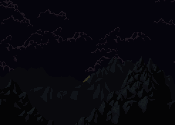
The last step was animating everything. I’m not sure if it’s clear or not, but the idea is that we initially see a timelapse (the moon rises and the clouds move fast) while the camera approaches the hotel. I wrote a little code to randomly place the clouds and move them across the screen at different speeds. I wrote a little more code to move everything into its final position. All of it was pretty simple.
The art is scaled in integer multiples (e.g. 2x, 3x, never 2.5x) to maintain the crisp edges. Depending on your aspect ratio, either the top/bottom or left/right edges of the screen can get cut off, especially if that ratio diverges far from 16:9. However, there’s never any black bars or other such nonsense.
So there you have it. I hope that’s helpful for somebody. Let me know what you think in the comments.
2 replies on “Making a Title Screen”
Appreciate the deep dive from one pixel pusher to another. 🙂
Personally I feel the deep shadow on the title for the final piece is very dissonant from the excellent pixel artwork. A pixelated drop shadow & outline would obscure less of the sky, be fairly simple to implement and respect the feeling you’ve established. Just a thought!
Thanks! There is a 2 pixel wide outline on it. Not sure how to implement a “pixelated” drop shadow though. The shadow obviously wasn’t hand made, but it’s at the same resolution as the background.
You might be interested to see this alternative font I made: https://pbs.twimg.com/media/DGll-M9VoAAaON6.jpg
I had to make this to fit the Steam trading card template and I was thinking about converting the logo elsewhere, but decided against it in the end.